Introduction
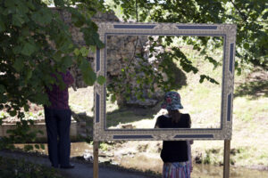
Photography as a means of artistic expression is not intended to be the main focus in this series. One can, however, argue with this statement by pointing out that the camera angle, the choice of image and the way it is framed are, for sure, exactly that.
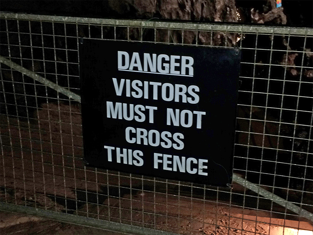
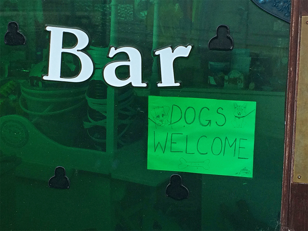
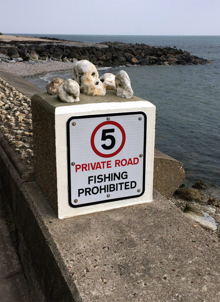
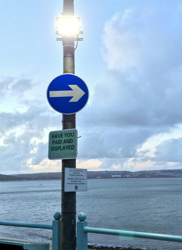
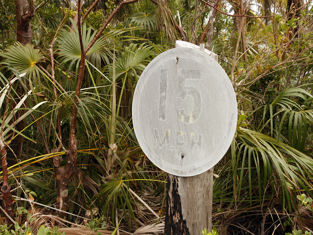
We have tried to document and highlight the messages we encounter repeatedly, everywhere and on a daily basis as objectively as we could.
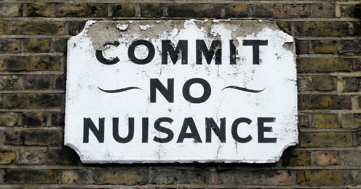
Our interest is in who the communications are directed at, what are their tone, aesthetical criteria and what reactions are expected from viewer.
There are echoes of the work by Professor Albert Merhabian, who showed (albeit in a study limited to a narrow cross-section of subjects) that with the spoken word more than half the meaning came from the body language of the speaker, more than a third from the tone of the voice and less than 10% from the words themselves.
How then does the presentation, staging and tone of the words in the signage affect how they are perceived and impinge on their effectiveness in delivering their imperative?
With an interest in semiotics, as well as the creation of images and the assembly of words, we find it impossible to ignore the detail of these visual imperatives.