 By
By There is an old rule of design, still debated today, which states “Form follows function”[1]. It was initially proposed in the late 1800s by architect Louis Sullivan[2] with respect to architecture although he himself attributed it to the Roman architect Vitruvius. Since then it has been applied to design in general and even more widely, most notably perhaps by Horatio Greenough in his 1947 essay Form and Function: Remarks on Art, Design and Architecture.[3]
I have always been a proponent of this, I think it works well in software design, ergonomics and even helps archaeologists interpret sites they are investigating via the artefacts uncovered. However, my faith is wavering as technology plays an increasing but often unseen part in our lives.
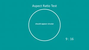
I first noticed this when display devices largely changed their standard aspect ratio of 3:4 to 9:16, heralded at the time as “widescreen format” for the picture plane. The original display devices for presentations were overhead projectors and slide projectors, where the format was similar. Even though presentations might not be art per se, there is still an element of composition putting together a slide that is easy to follow and aesthetically pleasing. People creating presentations were well used to making layouts that fitted neatly into 3:4 proportions and that meant adoption of early digital presentation aids like PowerPoint (others are available!) was a straightforward transition. That was true both for both image and text. On the face of it the change from 3:4 to 9:16 is a simple transformation to make digitally. There is a simple mathematical relationship, 9 is 32 and 16 is 42, so from a programming point of view it’s just a question of choosing a ruleset and applying a basic function to calculate a new presentation of all the pixels[4].


The effect on images of that might be blindingly obvious, all objects become horizontally stretched, circles become ellipses and faces look fatter. Think films made for cinema played on TV – the choice that faced the TV companies was either clip (perhaps vital) details from left and right or make the actors look thickset and round-faced. Tough choice – upset the stars or the creative directors.
The effect on text is perhaps less immediately apparent. Text would typically not be distorted by the internal algorithms of a display driver but simply repositioned based on a central point or wrapped differently, as you can now have more words on a line. That has subtle implications for layout though. A simple example would be a slide with two lists next to each other. In 9:16 you can have more words on a line but have less lines to play with. Many would say shorter lists are a good thing, however it does mean that to convert a presentation from old to the newer format was not just a case of pushing a button, it did require a total and careful redesign to keep the aesthetic.
Another consideration was compatibility of technology. The changeover from 3:4 to 9:16 took several years, if it is even complete, and took place at the same time as equipment evolved. Display technology moved from OHP or Slide Projector to plugging in a computer to a projector, then to direct connection of computer to a TV or display screen. This meant there was always a nervous few (or sometimes several) moments whilst the settings were checked and adjusted to find the best compromise between the capabilities of the components. Do you “letterbox”, transform or display 1:1?
At the same time as the presentation technology moved on so did the platform of choice. Direct viewing of artworks has relentlessly moved from in person to online, accelerated of course by the restrictions imposed on live events over the past couple of years. Devices used to access the internet have also moved at pace. Access from fixed desktop computers has declined, laptop use rose only to be usurped by mobile phones and tablets. This has further implications, but before those are addressed a quick and related thought about formats and design for online.


As the worldwide web developed a lot of previously printed material was made available via websites. The thing is that most printed publications use a portrait layout, books tend to be hinged along the long side of the paper. At its inception, most of the display devices had a landscape picture plane. This made the display of a full page on a screen nigh on impossible. Either the print was too small to read and lots of white space either side or you had to scroll down to see the bottom half of the page. Very few webmasters took the time or trouble to reformat on republication. Furthermore, the majority of sites being published from scratch adopted a portrait and scroll approach and I believe this is still true with the majority of websites being published with a “book” mindset prevailing. Where that is the case it represents a degree of missed opportunity. Websites are not inherently linear much more multi-dimensional with the opportunity to create backward, forward, circular and external links to a wealth of material which can be presented and approached from a variety of perspectives.
Now here’s the rub. As the type of display device has diversified so has the picture plane they use. Computer screens predominantly landscape, mobile phones default to portrait and tablets able to switch. To cope with that use is made of the application layer of the ISO model. This is where the data transmitted is made available to the viewer via their favourite browser. It is this that ultimately decides how what appears on the screen is laid out. That piece of software makes decisions about how to organise the content based on the actual device in use.
What does this mean for the designer? As new mediums other than traditional painting, such as video installation and multi-media and interactive works have grown in abundance the realisation has come that it’s very different composing for these disciplines than it was for an artist working on a physical medium. In that case, they had control of the choice of materials, canvas or paper, its size and aspect, oil or watercolour, brush size and shape – all of which they developed consummate skill in selecting and applying to create the composition they desired to present the viewer with the effect they intended. Perhaps the only dimensions not completely under their control was how, where and when it was displayed, the lighting and perhaps how it weathered over time.
So, what the emergence of art forms that increasingly contain or rely on elements of technology does mean is an erosion of control over the form and presentation. This was perhaps first encountered in the sphere of video installations where the size, quality and positioning of the monitor or the characteristics of the surface on which an artwork was projected hugely influenced the visual perception of the piece. That which once was largely under control became a struggle to achieve. New art forms and new technology required the development of a different mindset by both the artist and those staging exhibitions.
As a website designer, it’s impossible to be sure of which device or format the viewer will chose. The inherent capability and functionality of that device will factor into the way it is displayed. The choice of browser will also affect how the elements of a page are assembled and presented. Yes, one can test a layout on a variety of devices and make an educated guess about the most likely devices used by specific audiences, but control those elements? No.
That begs the question then who really is the ultimate arbiter of the composition and how it is presented for viewing? Certainly, not the author of the page. These days they will most likely be using some form of web design programme and/or a template that will have its own pre-defined rules and capabilities which constrain design choices on layout. Then there are the programmers of both the hardware and software presenting the image for viewing. Their choices, the algorithms they have composed long before the page is made or even afterwards, and their efficacy ultimately override the design choices of the original author. The best the author can hope for is sympathetic rendering of the effect they desire the viewer to experience. Oh, what a Tangled web we perceive, the system rules, ok.
[1] Form follows function is a principle of design associated with late 19th and early 20th century architecture and industrial design.
[2] Louis Sullivan (September 3, 1856 – April 14, 1924) was an American architect. He has been called a “father of skyscrapers” and “father of modernism”.
[3] Form and Function: Remarks on Art, Design and Architecture Edited by Harold A. Small Berkley and Los Angeles University of California Press. 1947 Pp. xxi, 148.
 By
By