There are many colour systems, however it seems that none of them offer an undeniable truth. Different colour theories have been predominant in different time periods. Present-day art education holds significant respect for such schools as Bauhaus (Wassily Kandinsky, Josef Albers), art movements and philosophies like Suprematism and De Stijl. These are just a few notable mentions as there are many other significant attempts to understand what potential and importance colour has got in contemporary art practice, theory and critical analysis.
“Colour is nothing but a sensation and has no existence at all independent of the nervous systems of living beings”, writes O. N. Rood.[1]
True, but why do we pay such attention to these sensations?
There have been many art practices clearly revealing the power of colour. This power has been felt far beyond the characteristics of one shade or another, it has created the need for some artists to own a particular colour. There have been several successful and less successful attempts to trademark colour and use it as a commodity inaccessible to others.
Colours have been named and systematised in various colour charts and instructive explanations on the best use of combinations. Colour study is more than an exact science, numerous artists have enriched existing concepts by expressing their views on the place of colour in their artistic practices.
In his work Joseph Albers[2] emphasised that the value of colour can be determined only in the context of other colours. He also noted that we never really perceive what colour is physically.
Artist Marcel Duchamp[3] was particularly dismissive of the importance of colour, by describing it as purely retinal activity. He preferred art practices which are more concerned with one’s intellect. His statements have got a solid base, as any objectivity about colour is doubtful when one realises that one person’s perception of a particular shade so differs from that of other people.
There are other approaches on what to do with colour: “Let’s use paint direct from the can.” Here the intention is to make the practice of painting more objective, not least by the fact that the colour has got a name or number and it has a determined place in a colour chart or catalogue.
Whether illusion, subjectivity or even when we rely on the predetermined quality of an industrial product (paint), we never really lose the feeling that colour possess a power and strongly influences our perception of the world. You just need to accidently land in a crowd of football club supporters and the colour of your scarf will be perceived as a strong statement of your views in this field.
There are many opinions on the wrongs and rights of colour perception, but its remarkable ability to be a formidable tool becomes apparent when given a cultural context. The colour becomes a symbol.
[1]Ogden Nicholas Rood (1831-1902) an American physicist best known for his work in colour theory. His Students’ Text-book of Color; Or, Modern Chromatics, with Applications to Art and Industry was first published in 1879.
[2]Josef Albers (1888-1976) a German-born artist and educator. He taught at the Bauhaus and Black Mountain College, headed Yale University’s department of design, and is considered one of the most influential teachers of the visual arts in the twentieth century. His Interaction of colour, first published in 1963, is considered a masterwork in art education.
[3]Marcel Duchamp (Henri-Robert-Marcel Duchamp 1887-1968) was a French-American artist, chess player, and art philosopher whose work is mainly associated with the conceptual art.
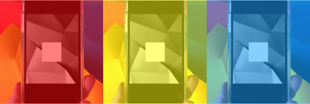
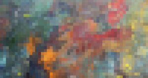
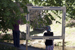
Digital photo collage

Watercolour on paper, 38 x 38 cm
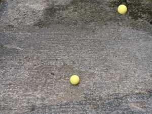
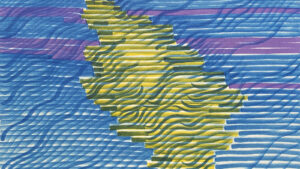
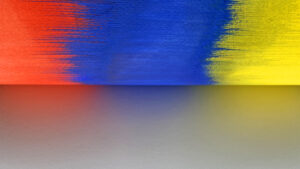
Watercolour on paper, 71.5 x 96.5 cm


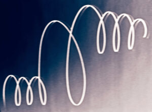
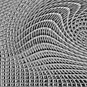
Coloured pencils on paper, 70 x 84 cm

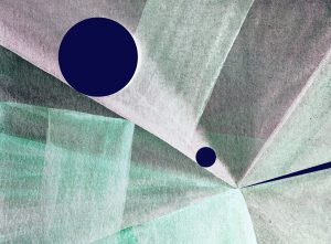
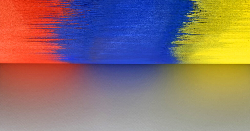
Watercolour on paper, 73.5 x 116 cm